Credit where credit is due, the idea, theory, and the code behind this was written by Maks Akymenko on css-tricks.com. See his excellent article, A Super Flexible CSS Carousel, Enhanced With JavaScript Navigation . This article outlines how I went about implementing this carousel using TailwindCSS and AlpineJS.
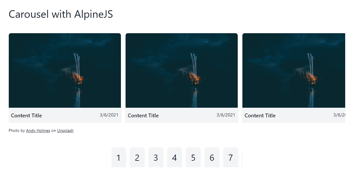
The carousel we are building is to represent some sort of content with tiles. The tiles have an image/thumbnail, a title, and a date. This could be a carousel of blog posts for example. To keep true to the "flexible" requirement we are also going to use this same carousel code for a carousel of numbers like a pagination component as demonstrated in the original article. The final result will look as follows.
The Structure
The basic structure for the markup is shown below. This was the starting point I used to convert the React components used in the article into plain HTML I could then apply Tailwind utilities to.
<div><!-- carousel -->
<div><!-- items container -->
<div>Item #1</div>
<div>Item #2</div>
<div>Item #3</div>
<div>Item #4</div>
<div>Item #5</div>
<div>Item #6</div>
<div>Item #7</div>
<div>Item #8</div>
<div>Item #9</div>
<div>Item #10</div>
</div>
<div> <!-- left navigation -->
<div><</div>
</div>
<div><!-- right navigation -->
<div>></div>
</div>
</div>
For the items I will be using a content tile with the following structure.
<div class="w-96 rounded-lg bg-gray-100 overflow-hidden shadow-md">
  <div><img src="/path/to/image.jpg"></div>
  <div class="px-2 py-3 flex justify-between">
    <div class="text-lg font-semibold">Content Title</div>
    <time>3/6/2021</time>
  </div>
</div>
Additional styling utilities we need
There are a couple of things that are not in Tailwind by default we will need to replicate this component. Namely we
need to add utilities for scroll-snap-align, scroll-snap-type, and to deal with hiding the scroll bar. There are
plugins you could install and if this were for production I would likely beef up the implementation to support
responsive variants, etc. But for this implementation I am going to inline them.
<style>
  .scroll-snap-x {
    scroll-snap-type: x mandatory;
  }

  .snap-center {
    scroll-snap-align: center;
  }

  .no-scrollbar::-webkit-scrollbar {
    display: none;
  }

  .no-scrollbar {
    -ms-overflow-style: none;
    scrollbar-width: none;
  }
</style>
The other thing we will need is to configure Tailwind to apply group-hover to the translate utilities. We need this to
show/hide the left/right navigation buttons when the mouse is hovering over the whole carousel. This can be accomplished
with a change in the tailwind.config.js file.
module.exports = {
  ...,
  variants: {
    extend: {
      translate: ['group-hover'],
    }
  },
};
With those in place we are ready for the styling
<div class="relative overflow-hidden group"><!-- carousel -->
<div class="md:-ml-4 md:flex md:space-x-4 space-y-4 md:space-y-0 md:overflow-x-scroll scroll-snap-x no-scrollbar">
<!-- items container -->
<div class="w-96 ml-4 flex-auto flex-grow-0 flex-shrink-0 snap-center">Item #1</div>
<div class="w-96 ml-4 flex-auto flex-grow-0 flex-shrink-0 snap-center">Item #2</div>
<div class="w-96 ml-4 flex-auto flex-grow-0 flex-shrink-0 snap-center">Item #3</div>
<div class="w-96 ml-4 flex-auto flex-grow-0 flex-shrink-0 snap-center">Item #4</div>
<div class="w-96 ml-4 flex-auto flex-grow-0 flex-shrink-0 snap-center">Item #5</div>
<div class="w-96 ml-4 flex-auto flex-grow-0 flex-shrink-0 snap-center">Item #6</div>
<div class="w-96 ml-4 flex-auto flex-grow-0 flex-shrink-0 snap-center">Item #7</div>
<div class="w-96 ml-4 flex-auto flex-grow-0 flex-shrink-0 snap-center">Item #8</div>
<div class="w-96 ml-4 flex-auto flex-grow-0 flex-shrink-0 snap-center">Item #9</div>
<div class="w-96 ml-4 flex-auto flex-grow-0 flex-shrink-0 snap-center">Item #10</div>
</div>
<div
class="hidden md:block absolute top-1/2 left-0 bg-white rounded-md transition-transform ease-in-out transform -translate-x-full -translate-y-1/2 group-hover:translate-x-0 cursor-pointer">
<!-- left navigation -->
<div><</div>
</div>
<div
class="hidden md:block absolute top-1/2 right-0 bg-white rounded-md transition-transform ease-in-out transform translate-x-full -translate-y-1/2 group-hover:translate-x-0 cursor-pointer">
<!-- right navigation -->
<div>></div>
</div>
</div>
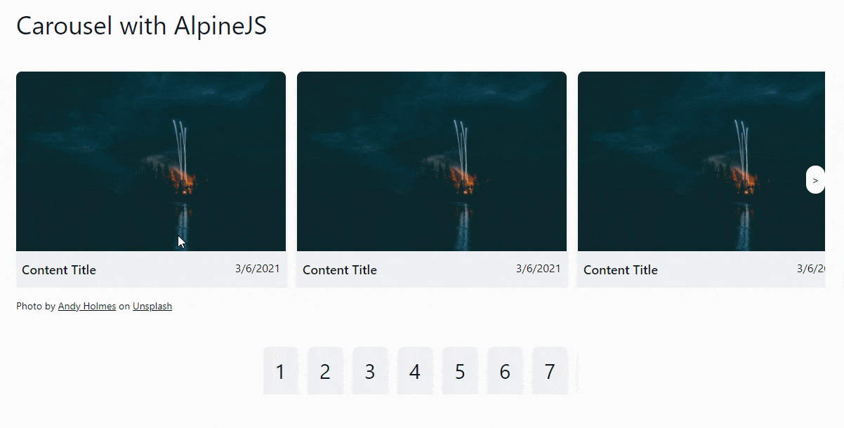
That gives you your basic carousel behavior with the additional display-on-hover left and right navigation. The only material change from the original article and this implementation is I adjusted for responsive behavior of vertically stacking the items in the carousel on small screens. At the md breakpoint it switches to the carousel behavior. That is the reason for the space-x and space-y utilities on the items container as well as the hidden and md:block display utilities on the navigation buttons.
Note the use of the group utility on the parent carousel div and then using group-hover:translate-x-0 on the
navigation buttons to ease them into the carousel on hover.
Adding the JavaScript for the navigation buttons
The logic behind the code is very well explained in the original article so I am not going to go into it here. Instead I am only going to show how I changed it to work in an AlpineJS component. First I will show how this is wired to the markup and then how it is implemented.
<div x-data="carousel()" x-init="init()"><!-- carousel -->
<div x-ref="container"><!-- items container -->
<div>Item #1</div>
<div>Item #2</div>
<div>Item #3</div>
<div>Item #4</div>
<div>Item #5</div>
<div>Item #6</div>
<div>Item #7</div>
<div>Item #8</div>
<div>Item #9</div>
<div>Item #10</div>
</div>
<div @click="scrollTo(prev)" x-show="prev !== null"> <!-- left navigation -->
<div><</div>
</div>
<div @click="scrollTo(next)" x-show="next !== null"><!-- right navigation -->
<div>></div>
</div>
</div>
The x-ref="container" is admittedly a little hack just to avoid doing this.$el.querySelector('...') or similar to
find this container. But it's a tool available so I'll use it. To start we need a carousel() data provider.
window.carousel = function () {
  return {
    prev: null,
    next: null,
    init() {
    },
    scrollTo(element) {
    }
  };
}
That is the bulk of the public API we need for this data object. To initialize the carousel we need to find the container of all the items and do some calculations to determine where we are in terms of which item we are currently seeing and whether there are previous or next items in the carousel so we can show or hide the navigation buttons as well as configure them with the correct item to determine where to scroll the carousel on click.
window.carousel = function () {
  return {
    container: null,
    prev: null,
    next: null,
    init() {
      this.container = this.$refs.container

      this.update();

      this.container.addEventListener('scroll', this.update.bind(this), {passive: true});
    },
    update() {
      const rect = this.container.getBoundingClientRect();

      const visibleElements = Array.from(this.container.children).filter((child) => {
        const childRect = child.getBoundingClientRect()

        return childRect.left >= rect.left && childRect.right <= rect.right;
      });

      if (visibleElements.length > 0) {
        this.prev = this.getPrevElement(visibleElements);
        this.next = this.getNextElement(visibleElements);
      }
    },
  };
};
There are only a couple small adaptations here in that I am binding the component to the update method on the scroll
listener and managing the state of this.prev and this.next manually. Otherwise this is almost a direct lift from the
original code. The getPrevElement and getNextElement methods are also basically identical to the source.
window.carousel = function () {
  return {
    ...,
    getPrevElement(list) {
      const sibling = list[0].previousElementSibling;

      if (sibling instanceof HTMLElement) {
        return sibling;
      }

      return null;
    },
    getNextElement(list) {
      const sibling = list[list.length - 1].nextElementSibling;

      if (sibling instanceof HTMLElement) {
        return sibling;
      }

      return null;
    },
  };
};
The last piece is the click handler for the nav buttons, scrollTo(element).
window.carousel = function () {
  return {
    ...,
    scrollTo(element) {
      const current = this.container;

      if (!current || !element) return;

      const nextScrollPosition =
        element.offsetLeft +
        element.getBoundingClientRect().width / 2 -
        current.getBoundingClientRect().width / 2;

      current.scroll({
        left: nextScrollPosition,
        behavior: 'smooth',
      });
    }
  };
}
All together
With the exception of the tailwind configuration change needed, the code behind the screenshot is below in its entirety. I also added this to another project as a live demo.
<div class="mt-24">
<script>
window.carousel = function () {
return {
container: null,
prev: null,
next: null,
init() {
this.container = this.$refs.container
this.update();
this.container.addEventListener('scroll', this.update.bind(this), {passive: true});
},
update() {
const rect = this.container.getBoundingClientRect();
const visibleElements = Array.from(this.container.children).filter((child) => {
const childRect = child.getBoundingClientRect()
return childRect.left >= rect.left && childRect.right <= rect.right;
});
if (visibleElements.length > 0) {
this.prev = this.getPrevElement(visibleElements);
this.next = this.getNextElement(visibleElements);
}
},
getPrevElement(list) {
const sibling = list[0].previousElementSibling;
if (sibling instanceof HTMLElement) {
return sibling;
}
return null;
},
getNextElement(list) {
const sibling = list[list.length - 1].nextElementSibling;
if (sibling instanceof HTMLElement) {
return sibling;
}
return null;
},
scrollTo(element) {
const current = this.container;
if (!current || !element) return;
const nextScrollPosition =
element.offsetLeft +
element.getBoundingClientRect().width / 2 -
current.getBoundingClientRect().width / 2;
current.scroll({
left: nextScrollPosition,
behavior: 'smooth',
});
}
};
}
</script>
<style>
.scroll-snap-x {
scroll-snap-type: x mandatory;
}
.snap-center {
scroll-snap-align: center;
}
.no-scrollbar::-webkit-scrollbar {
display: none;
}
.no-scrollbar {
-ms-overflow-style: none;
scrollbar-width: none;
}
</style>
<h1 class="text-4xl">Carousel with AlpineJS</h1>
<div class="mt-12 flex mx-auto items-center">
<div x-data="carousel()" x-init="init()" class="relative overflow-hidden group">
<div x-ref="container"
class="md:-ml-4 md:flex md:overflow-x-scroll scroll-snap-x md:space-x-4 space-y-4 md:space-y-0 no-scrollbar">
<div
class="ml-4 flex-auto flex-grow-0 flex-shrink-0 w-96 rounded-lg bg-gray-100 items-center justify-center snap-center overflow-hidden shadow-md">
<div><img src="/assets/images/andy-holmes-4iapyjvm714-unsplash-sm.jpg"></div>
<div class="px-2 py-3 flex justify-between">
<div class="text-lg font-semibold">Content Title</div>
<time>3/6/2021</time>
</div>
</div>
</div>
<div @click="scrollTo(prev)" x-show="prev !== null"
class="hidden md:block absolute top-1/2 left-0 bg-white p-2 rounded-full transition-transform ease-in-out transform -translate-x-full -translate-y-1/2 group-hover:translate-x-0 cursor-pointer">
<div><</div>
</div>
<div @click="scrollTo(next)" x-show="next !== null"
class="hidden md:block absolute top-1/2 right-0 bg-white p-2 rounded-full transition-transform ease-in-out transform translate-x-full -translate-y-1/2 group-hover:translate-x-0 cursor-pointer">
<div>></div>
</div>
</div>
</div>
<div class="mt-4 px-4 md:px-0 text-sm"><span>Photo by <a class="underline"
href="https://unsplash.com/@andyjh07?utm_source=unsplash&utm_medium=referral&utm_content=creditCopyText">Andy Holmes</a> on <a
class="underline"
href="https://unsplash.com/t/color-theory?utm_source=unsplash&utm_medium=referral&utm_content=creditCopyText">Unsplash</a></span>
</div>
</div>
<div class="mt-12 flex max-w-md mx-auto items-center">
<div x-data="carousel()" x-init="init()" class="relative overflow-hidden group">
<div x-ref="container"
class="md:-ml-4 md:flex md:overflow-x-scroll scroll-snap-x md:space-x-4 space-y-4 md:space-y-0 no-scrollbar">
<div
class="ml-4 px-2 py-4 flex-auto flex-grow-0 flex-shrink-0 w-12 rounded-lg bg-gray-100 items-center justify-center snap-center overflow-hidden shadow-md">
<div class="text-3xl text-center">1</div>
</div>
<div
class="ml-4 px-2 py-4 flex-auto flex-grow-0 flex-shrink-0 w-12 rounded-lg bg-gray-100 items-center justify-center snap-center overflow-hidden shadow-md">
<div class="text-3xl text-center">2</div>
</div>
<div
class="ml-4 px-2 py-4 flex-auto flex-grow-0 flex-shrink-0 w-12 rounded-lg bg-gray-100 items-center justify-center snap-center overflow-hidden shadow-md">
<div class="text-3xl text-center">3</div>
</div>
<div
class="ml-4 px-2 py-4 flex-auto flex-grow-0 flex-shrink-0 w-12 rounded-lg bg-gray-100 items-center justify-center snap-center overflow-hidden shadow-md">
<div class="text-3xl text-center">4</div>
</div>
<div
class="ml-4 px-2 py-4 flex-auto flex-grow-0 flex-shrink-0 w-12 rounded-lg bg-gray-100 items-center justify-center snap-center overflow-hidden shadow-md">
<div class="text-3xl text-center">5</div>
</div>
<div
class="ml-4 px-2 py-4 flex-auto flex-grow-0 flex-shrink-0 w-12 rounded-lg bg-gray-100 items-center justify-center snap-center overflow-hidden shadow-md">
<div class="text-3xl text-center">6</div>
</div>
<div
class="ml-4 px-2 py-4 flex-auto flex-grow-0 flex-shrink-0 w-12 rounded-lg bg-gray-100 items-center justify-center snap-center overflow-hidden shadow-md">
<div class="text-3xl text-center">7</div>
</div>
<div
class="ml-4 px-2 py-4 flex-auto flex-grow-0 flex-shrink-0 w-12 rounded-lg bg-gray-100 items-center justify-center snap-center overflow-hidden shadow-md">
<div class="text-3xl text-center">8</div>
</div>
<div
class="ml-4 px-2 py-4 flex-auto flex-grow-0 flex-shrink-0 w-12 rounded-lg bg-gray-100 items-center justify-center snap-center overflow-hidden shadow-md">
<div class="text-3xl text-center">9</div>
</div>
<div
class="ml-4 px-2 py-4 flex-auto flex-grow-0 flex-shrink-0 w-12 rounded-lg bg-gray-100 items-center justify-center snap-center overflow-hidden shadow-md">
<div class="text-3xl text-center">10</div>
</div>
</div>
<div @click="scrollTo(prev)" x-show="prev !== null"
class="hidden md:block absolute top-1/2 left-0 bg-white p-2 rounded-full transition-transform ease-in-out transform -translate-x-full -translate-y-1/2 group-hover:translate-x-0 cursor-pointer">
<div><</div>
</div>
<div @click="scrollTo(next)" x-show="next !== null"
class="hidden md:block absolute top-1/2 right-0 bg-white p-2 rounded-full transition-transform ease-in-out transform translate-x-full -translate-y-1/2 group-hover:translate-x-0 cursor-pointer">
<div>></div>
</div>
</div>
</div>